Third-Party Career Building App
The Client
Adobe Inc. is an American multinational computer software company. Incorporated in Delaware and headquartered in San Jose, California, it has historically focused upon the creation of multimedia and creativity software products, with a more recent foray towards digital marketing software. In September 2020, Adobe issued a design challenge to General Assembly graduates to build a third-party mobile app.
The Brief
Design a third-party mobile app to help underrepresented workers access hiring opportunities, showcases, communities, and/or other resources that ultimately empower them and allow them to thrive. This will be a conceptual challenge and will require ideation, testing, and design skills in order to meet basic requirements.
Timeline: 72 Hours
Our Team / My Role
The Design team consisted of (3) members with varying strengths and abilities. Our complementary skillsets proved to be an asset towards meeting our goals as a unit.
My responsibilities included:
Ideation: We would need to create a new product from scratch at record-pace which demanded quick ideation, and experience in product design. While this mobile app wasn’t actually intended to hit the market, it was important that it both feel and act like a real product. My background in marketing would prove valuable both during conception and in communicating our brand.
Design: Using Adobe XD, each member of the team created wireframes to support a low-to-high fidelity output.
Testing: Together, our entire team would conduct usability tests with users and collaborate on revisions.

We had some very loooooong days
Product Research
We first needed to define the product — understand who the users were, and what they wanted — before we could establish a worthwhile product and brand.
Who is: Our User?
Our team felt strongly that we wanted to focus on underrepresented workers who came from lower socio-economic background, and empower them with a new and viable professional tool to help them break into the professional marketplace.
As a former Big Brothers Big Sister of America volunteer, and Year Up mentor, this was a cause which was important to me, and an area in which I had several years of first-hand experience dealing with the targeted user.
Additional research considerations:

My volunteer experience helped inform the product
“As a result of these cultural differences, young professionals can experience a feedback vacuum in the professional world — wondering how to improve, if they need to improve, and how they can develop the skills necessary to improve at their firm and in their career.”
— Harvard Business Review, April 2019

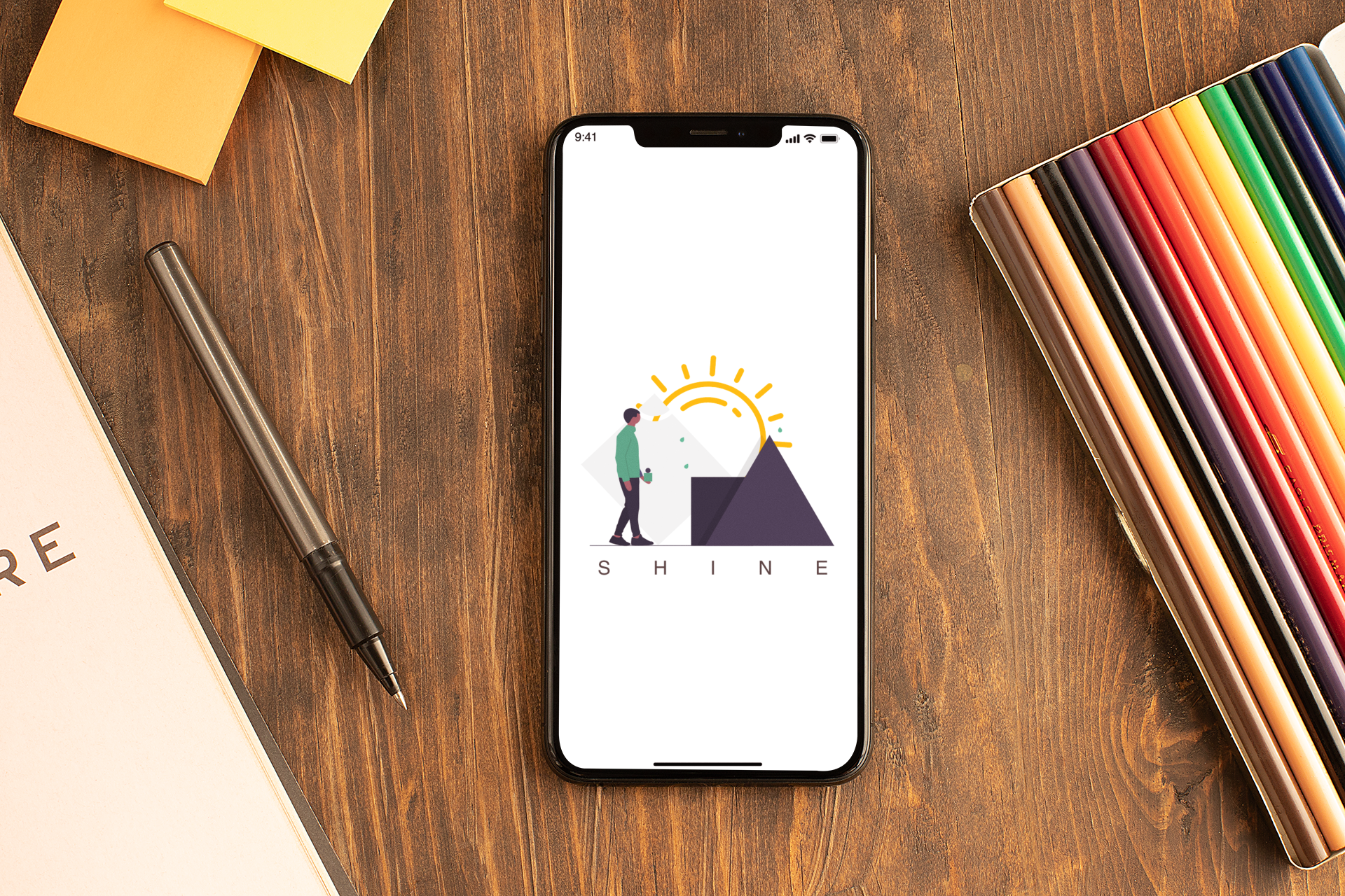
The Product — Shine
After careful consideration and conversation, our team agreed on a product in which to design…
Shine is a powerful, easy-to-use tool that combines the benefits of expert guidance with actionable steps towards entering the job market. Envisioned as a platform for the continued growth of young professionals, Users will keep coming back to make resume updates, practice skills, and connect with their Mentors throughout the first few years of their careers - establishing a solid foundation so that Users may each shine while undergoing their respective professional pursuits.
Research: Personas
I created a Persona known as Jared The Job Hunter, that helped serve as a North Star for ideation and design.
Design
Now that ideation was complete, it was time to move onto design. During this phase I collaborated with my UX team-members to determine a general aesthetic and create low-to-high fidelity wireframes.
A sketch on Adobe
Ideation: Drafting
While this quick mockup (seen on left) didn’t require pen and paper to make, I still consider it a sketch due to its rapid-fire creation and crudeness. This drawing in particular helped me onboard to Adobe XD as a first-time user, and gave me a potential aesthetic to discuss with my team-members.
Additional Considerations:
I wanted to make a profile that users could modify that would also be outward facing for potential employers and networkers to view. This profile could would be available via URL, and could be attached to applications, LinkedIn pages, and sent directly to others via message(s) and email.
A video would help a user tell their story: what makes their background and personality unique, an opportunity to communicate a user’s abilities and talents, and a chance for potential employers and networkers know them as more than simply text on a static resume.
Ideation: User Flows
While deciding on an appropriate user flow(s), we as a team decided to create (5) paths.
Flow #1 - will focus on a user updating their ABOUT ME.
Flow #2 - will focus on a user updating their VIDEO STORY.
Flow #3 - will focus on a user updating their RESUME.
.Flow #4 - will focus on a user updating their COVER LETTER.
Flow #5 - will focus on a user checking their EMAIL to post
Usability Tests: UX Writing
Once wireframes were complete, we underwent a testing round in order to reveal potential usability problems.
Insights:
While we tried to make the product as intuitive as possible, we realized it would help to build even more prompts to better show users how to best navigate this product.
Usability Tests: Opener & Copy
Insights:
Users had some trouble with onboarding (“what do I do?”) so we had to make stronger choices with how we presented the opening screen.
For clarity, we strengthened copy throughout the platform, most notably adding “Send To Mentor” language once users submit materials.
Prototype
Having made design adjustments thanks to usability testing, we were prepared to present our work.
Prototype: Demo 1
Here we demonstrate how users can change their public facing profile, starting with their “About Me” section, and then recording an “Intro Video.”
With each task, users submit materials to a mentor to give feedback and/or request changes.
Prototype: Demo 2
Next, we demonstrate how users can update with “resume” citing new work experience, and a corresponding “cover letter” and send to mentor.
Finally, a mentor reviews submitted material and gives it approval for public consumption. This is done in a chat feature.
Takeaways
After completing a prototype in 72 hours, we successfully completed the Adobe challenge. However, there were takeaways….
What Worked
We received fruitful feedback on our design, especially given the super strict time parameters. While implementing additional testing, we received comments from users commented who believed this could be a viable and useful product if ever actually put into market.
What Could Use Work
Adobe experts noted there was room for improvement with some of our UX writing, our chosen UI toolkit elements, and the general workflow of the app. All good learning lessons…
Hindsight being 20/20, I believe we should have opted to create a scenario where the user builds their profile from scratch rather than updating information. I think this may have been an easier scenario to show off how the app can work, and would have been easier to onboard.